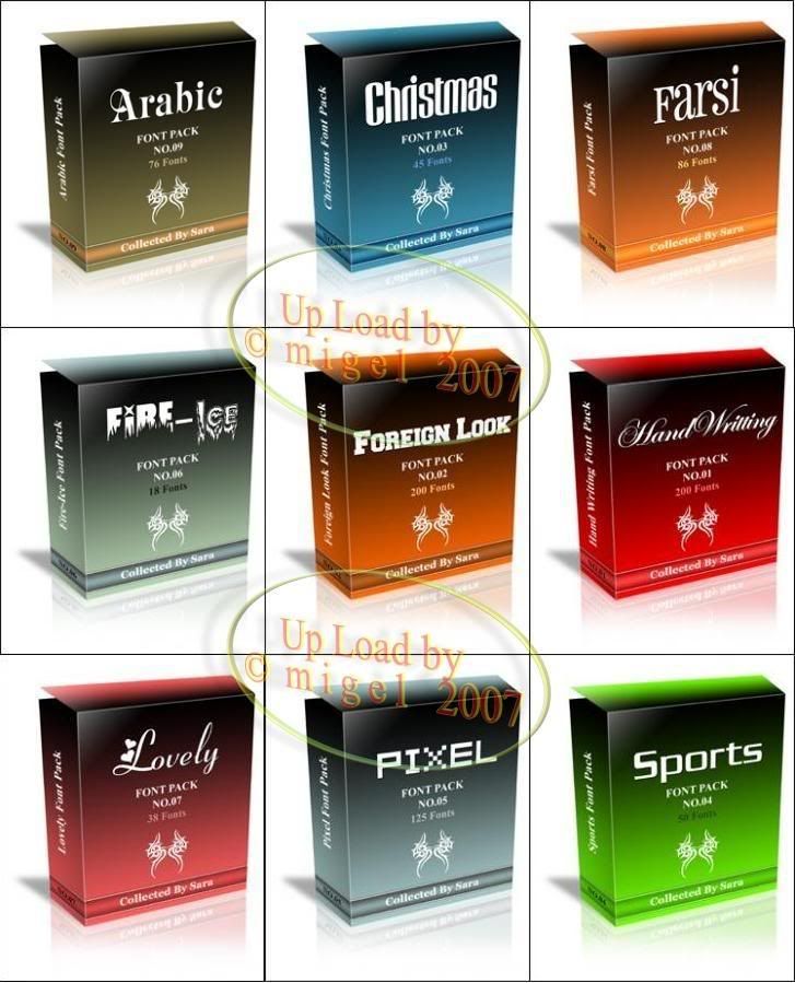
Hi dude, here’s a large amount of fonts you looking for. This font pack ranging from Arabic to art fonts. Just download and install fonts you love into your machine.
Oh yea, of course you don’t want to install this huge amount of fonts because it will give your computer a huge load. So, all you need is only a number of fonts you really want. That’s need a font explorer I recommend this Free program
1. Font Explorer

You can download Font Explorer here.
2. Karens Font Explorer

Download the program above here
While your 9 Fonts package is below

So, here’s a little tip on how to chose font that match your design
Question: What is the Best Way to Choose or Mix and Match Fonts?
There are no absolutely right or wrong ways to choose fonts or mix different fonts in a design project. However, there are a few accepted standards that can speed up the font selection process and generally result in typographically attractive and readable compositions.
Answer: These guidelines won't always work for you, but nine times out of ten they'll give you the results you want with the least amount of trial and error. Use them when you're in a hurry or when you've hit a mental roadblock and need to jumpstart a design project.
- Use Serif Text with Sans Serif Headline
When in doubt, pair a serif font for body text and a sans serif font for headlines.This is not a rule. This is simply a good starting point for when you're stuck for ideas or can't seem to find the right mix. In most cases a serif plus a sans serif provides good contrast and doesn't overwhelm with too many fonts.
- Use Contrasting Styles
Avoid mixing two very similar typefaces, such as two scripts or two sans serifs. There is not enough contrast and the small differences will cause a visual clash.This is one reason that pairing a serif with a sans serif font works so well. There's generally good contrast.
- Use Fewer Fonts
Limit the number of different typefaces used in a single document to no more than three or four.With too many different fonts you run into problems with not having enough contrast between similar font styles plus a lack of consistency and even a feeling of choppiness because there are too many distractions. Using just one typeface can be better than two or three or four or more.
- Use Proportional Fonts
Avoid monospaced typefaces for body copy. They draw too much attention to the individual letters distracting the reader from the message.The best body copy fonts are the least distinctive. They generally have less extreme parts or unusual character shapes. This is one place where boring can be better. Use fonts with more distinctive characters in headlines and pull-quotes and other places where you want to grab attention and pull the reader into the story.
0 comments:
Post a Comment